Commercial Appliance Repair
Santa Barbara, California
A Logo Refresh
For an Established Small Business
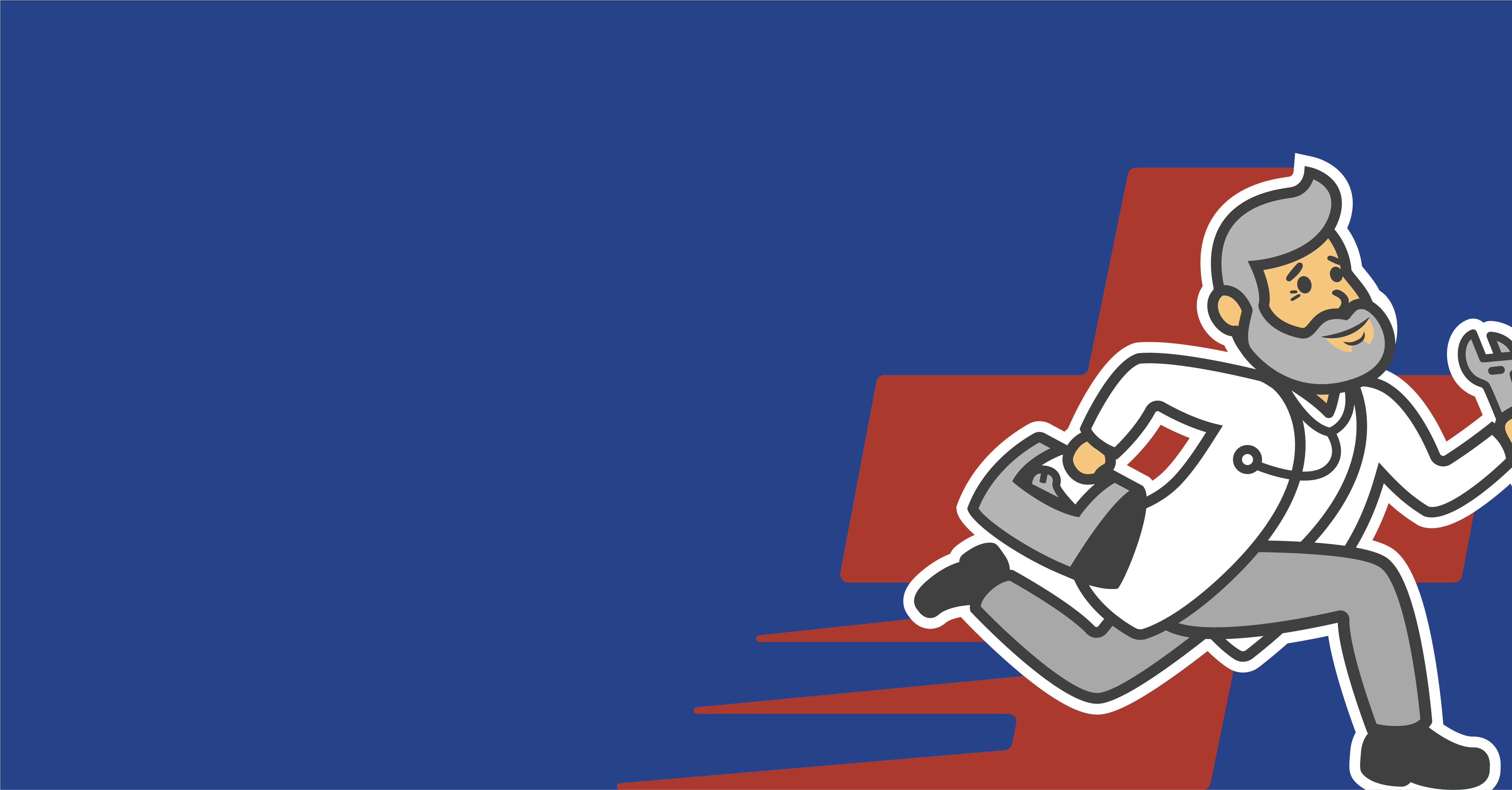
Marvin, the owner and operator of Commercial Appliance Repair, has been servicing commercial appliances since 1987. When he reached out to our team, he knew his pixelated logo needed a refresh. But he didn’t want to lose his hard-earned brand recognition with local, Santa Barbara restaurants. Our team worked closely with Marvin to modernize his logo design while keeping the key elements in place to maintain his brand recognition with his clients. Because Marvin uses his logo in several different places, we designed for flexibility with full color and one color options so it will display nicely on business cards, uniforms, vehicles, and anywhere else Marvin chooses to show off his refreshed logo.
Logo Design
Brand Colors
Grays and blue with a pop of “emergency” red to convey a sense of urgency.
Dark Gray
Color Formula
#414042
Light Gray
Color Formula
#a7a9ac
Blue
Color Formula
#224191
Red
Color Formula
#186a7c
Logo Before & After
Hover to see the difference.