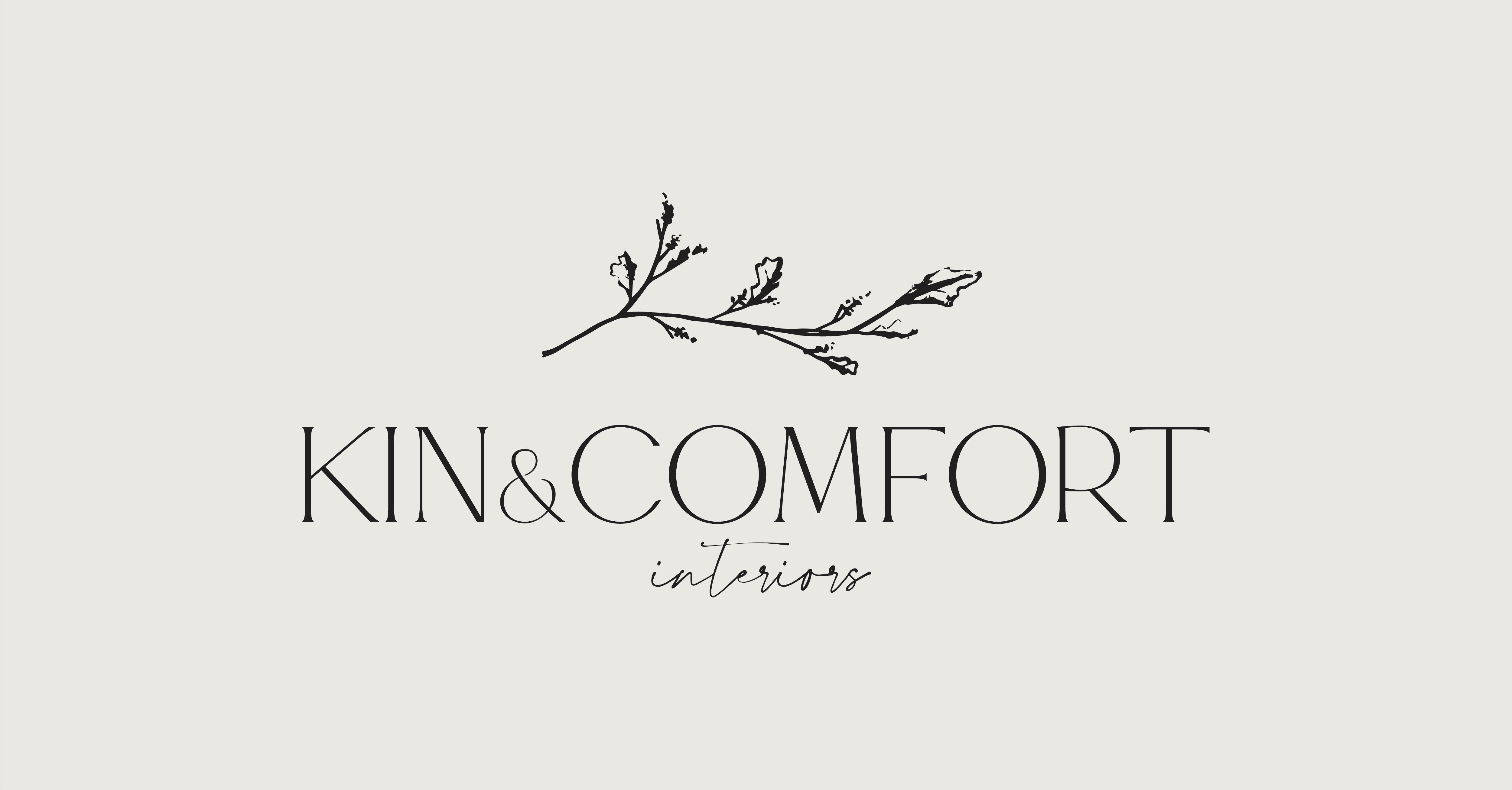
Kin & Comfort Interiors
Boerne, Texas
A New Brand
For a New Interior Design Business
Caitlin and Nikki had just started a new interior design business and had nothing but a name when they reached out to our team. Their business vision was to create simple and beautiful interiors for busy Texas Hill Country families with a southern nod. Starting with a hand-drawn sketch, our team created a logo for Kin & Comfort Interiors designed to communicate the timeless, relaxed sophistication that embodies Caitlin and Nikki’s signature style.
Logo Design
Brand Colors
Understated, earthy colors for a timeless brand.
Moss
Color Formula
#868c83
Sage
Color Formula
#c3c6bd
Cream
Color Formula
#eae9e3

“Daor Design was a breeze to work with. From the very first consultation to the end result. We would recommend them to anyone!”
Nikki
Owner, Kin & Comfort Interiors
Graphic Design Projects


Mental Health Association of Alameda CountyDaor Design2024-03-19T16:31:51-05:00
Mental Health Association of Alameda County
Piedmont Hills Montessori AcademyDaor Design2024-03-19T17:07:01-05:00