Ople

San Mateo, California

Hitting Refresh

For a Silicon Valley Startup

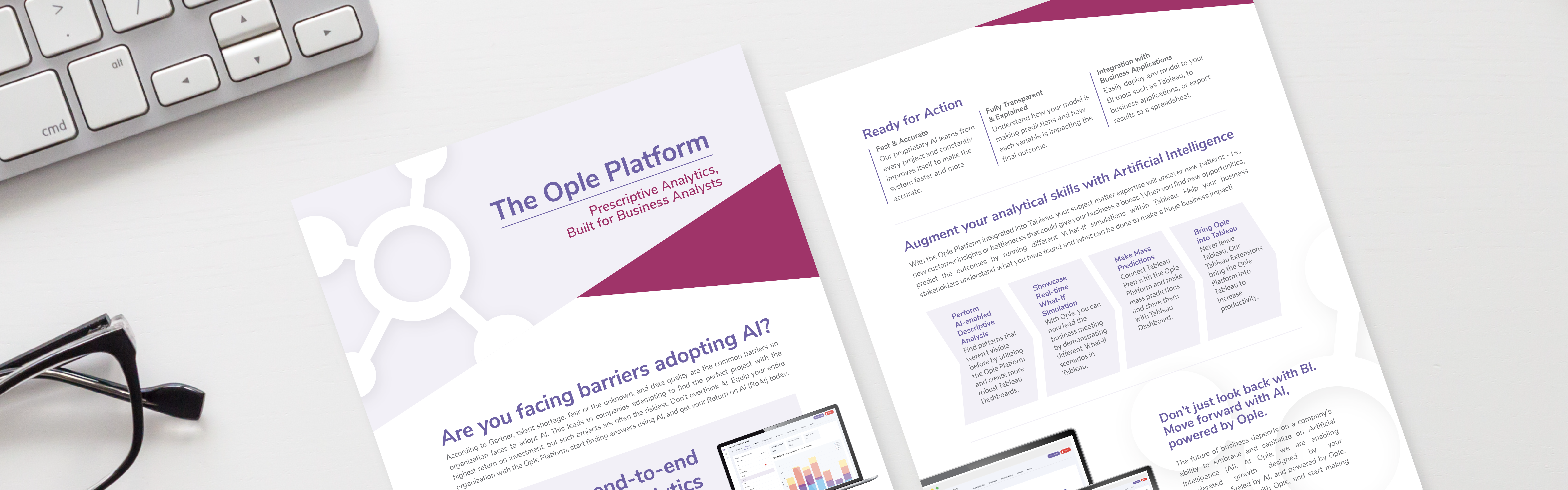
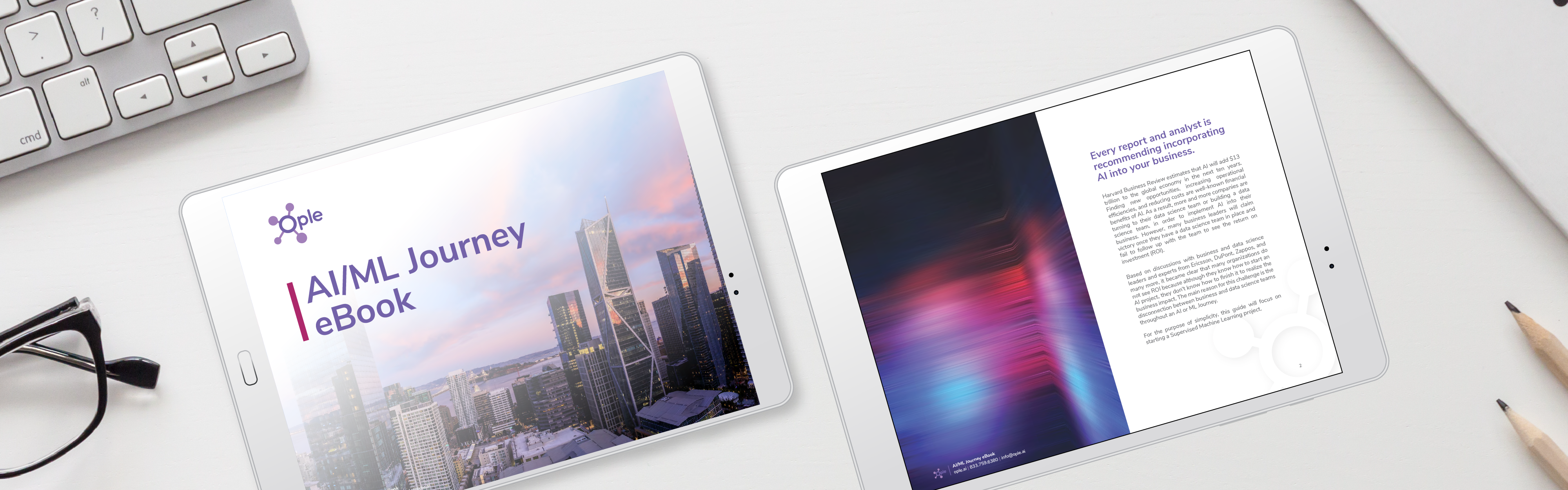
As the Ople startup began to take off, they wanted to circle back around and put a professional touch on their brand – and then build out a collection of branded materials. Over several weeks, our team worked closely with the Ople team to prepare official logo variations, company brand guidelines, a custom icon collection, several branded flyers, a couple ebooks, and an infographic. Take a look at some of our work on the Ople brand.

Logo Design

  • Two logos side by side, both showcasing the word "Ople" with an abstract, molecule-like icon adjacent to the text. The left logo is on a light purple background, while the right logo
  • A group of people collaborating over a digital tablet with the logo of "Ople" visible on the left.
  • The image shows a repeating pattern of various flat design icons representing data analytics and business intelligence. Elements include graphs, targets, shields, magnifying glasses, and folders, suggesting a theme of strategy, data

Brand Colors

Playful, inviting colors chosen to make AI look easy.

Lavender

Color Formula

#f3f1f8

Plum

Color Formula

#a482bb

Purple

Color Formula

#7162ab

Raspberry

Color Formula

#ae286b

Gray

Color Formula

#6d6e71

Marketing Services

  • This image showcases a series of informative brochures or leaflets laid out side by side, each with text and graphic elements, likely designed to provide an overview and details about a product or service offered
  • Printed marketing materials with graphs and text content lying next to a computer keyboard on a white surface.
  • Two tablets on a white desk displaying an Ople ai/ml journey ebook and a book page respectively, accompanied by a pencil and keyboard.

Graphic Design Projects