Runde & Partners
San Francisco, California
A Rebrand
For a Property Valuation Company
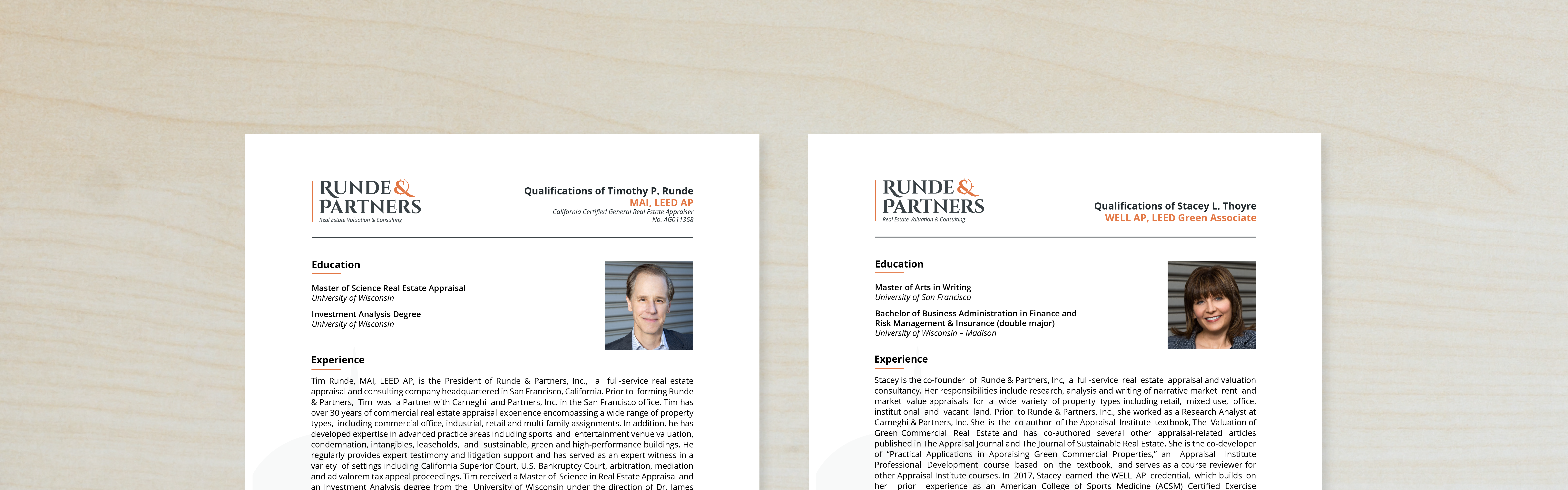
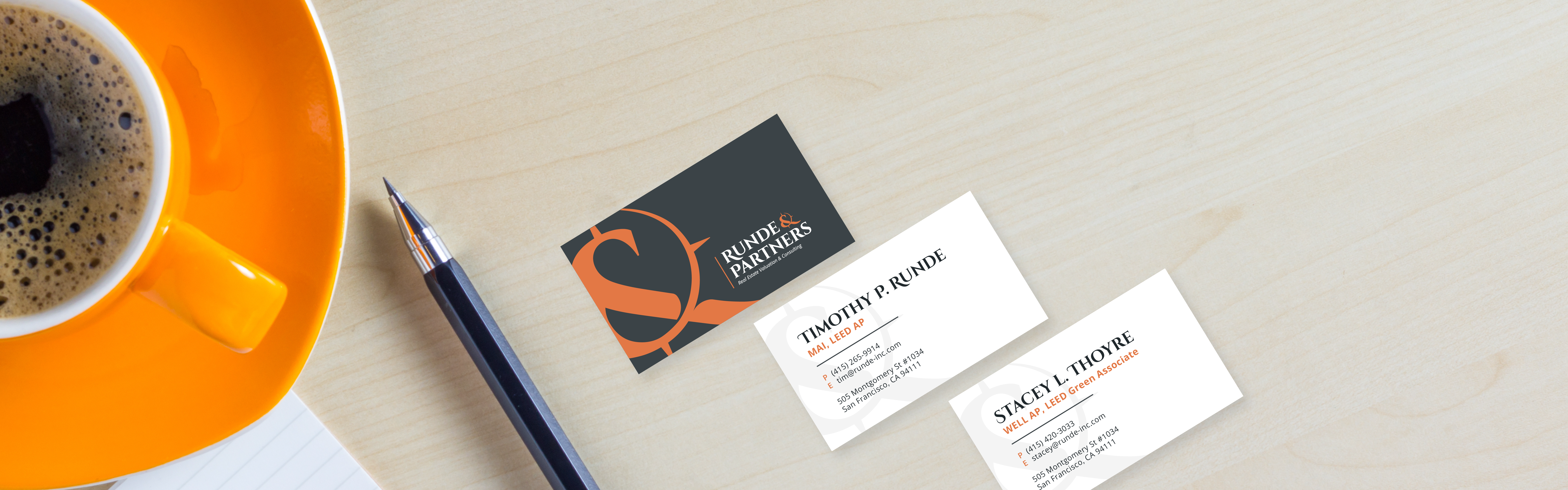
Stacey and Tim were looking to freshen up their brand. After their initial brand consultation, our team designed the new Runde & Partners logo to resonate with their target market in the San Francisco Bay Area. From there, we designed their new website to communicate clearly to prospective clients. We wrapped up with business cards, letterhead and branded business materials each designed to reflect the new Runde & Partners brand.
Logo Design
Brand Colors
Traditional blues and grays with a pop of orange.
Fog
Color Formula
#e8eaea
Stone
Color Formula
#394347
Midnight
Color Formula
#1e292d
Tangerine
Color Formula
#f37035
Website Design
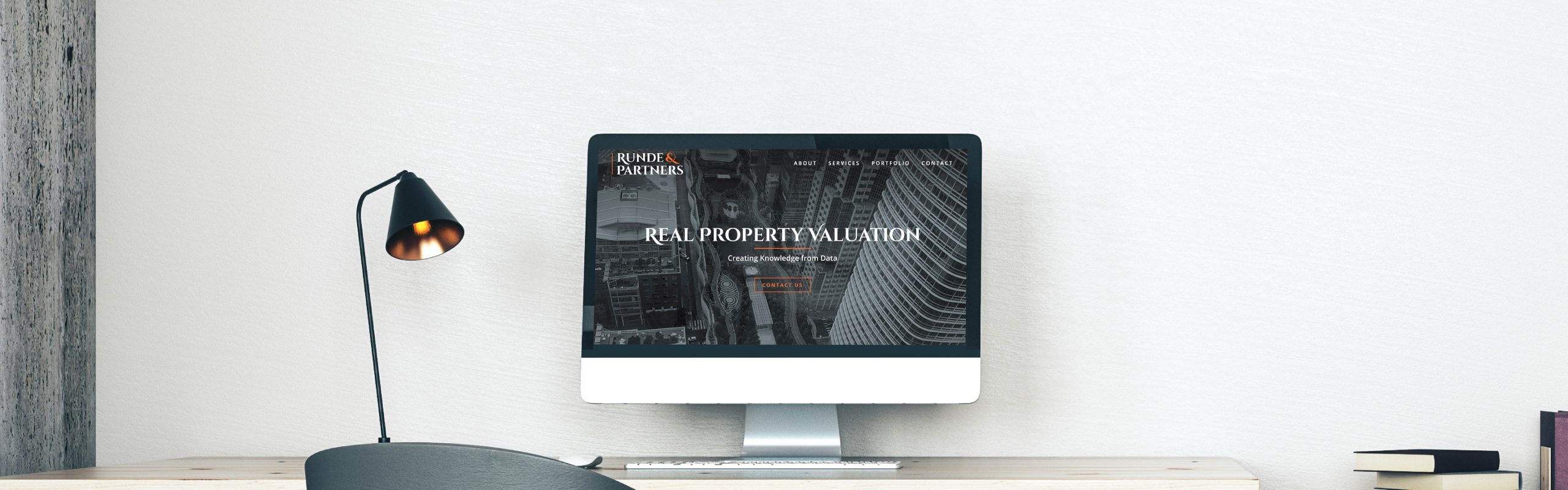

User
Journeys
A website designed to easily guide people from the home page to the contact page with streamlined messaging and a clear call to action.
Responsive
Design
A mobile-friendly design so this website looks great and works seamlessly on all devices including computers, tablets, and phones.
SEO
Setup
A well-organized website with a sitemap submission to Google and Google Analytics turned on to track and grow traffic from day one.
Marketing Projects


“Nimble. Creative. Responsive. That’s Daor Design. Tim and I had been trying to find someone to re-do our website and logo for a very long time. The Daor Design team was worth the wait! We were amazed by how quickly they came up with compelling logo options based on discussions we had with them about our company’s guiding principles and what differentiates us from our peers. Ditto for the website design: they asked us meaningful questions, really listened to our answers, then delivered a concept that captured those discussions. Communication throughout the process was clear and prompt. Even though we are a small business, Daor Design never made us feel like we were inconsequential. They made us feel like our project mattered. They made us feel like our success was their success. I would not hesitate to engage their team again on future projects!”