Tague Consulting
San Francisco, California
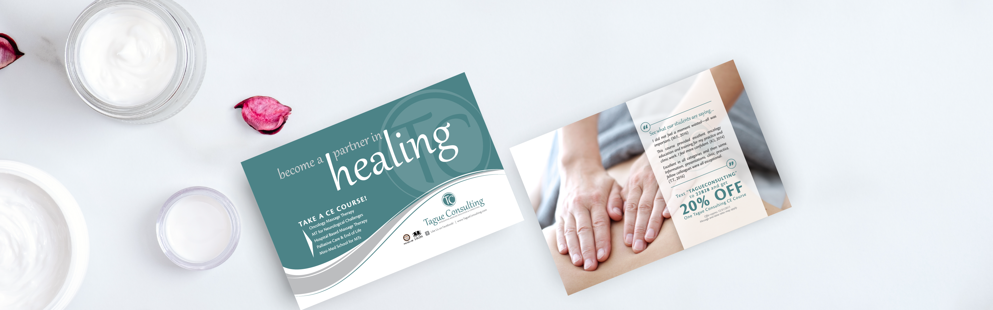
A Refreshed Brand
For an Established Massage Therapy Practice
Carolyn was looking to freshen up her brand with a refreshed logo and new postcard design. Her logo had the right idea behind it but needed some simplification to give it a clean, professional look. Carolyn also had a lot of hard-earned brand recognition with her old logo, so we wanted to be sure to keep that intact for her. Instead of a completely new logo, we were able to refresh the old Tague Consulting logo to maintain brand recognition while modernizing the look. From there, we refreshed Carolyn’s postcard design to match her refreshed logo. Take a look at our work with Carolyn and her team at Tague Consulting.
Logo Design
Brand Colors
A soothing brand palette to help put patients at ease.
Aquamarine
Color Formula
#388589
Calming Gray
Color Formula
#186a7c
Marketing Projects

“They were great to work with on a new logo and an over-sized postcard project. They took my amateurish drafts and made them WOW. I selected them in part because of their reasonable time estimates. I’ll use this team again, no doubt.”
Carolyn
Owner, Tague Consulting