The Croner Company
San Rafael, California
A Brand Refresh
For a Compensation Consulting Firm
As a global leader in the compensation consulting space, The Croner Company wanted to maintain its strong brand recognition – but they also knew it was time for a refresh. That’s where we came in. Our team worked closely with the leadership at The Croner Company to update the existing brand with a logo refresh designed to help modernize the brand while keeping decades of existing brand recognition in place. From there, we designed the new website to clearly articulate The Croner Company’s services and make their compensation surveys readily available to the market. Take a look at our work on the Croner brand.
Logo Design
Brand Colors
A traditional blue color palette with pops of red.
Fog Gray
Color Formula
#f7f6f5
True Blue
Color Formula
#2f60a5
Navy Blue
Color Formula
#203c74
Night Blue
Color Formula
#151b2c
Cardinal Red
Color Formula
#c92035
Maroon Red
Color Formula
#6d0f1d
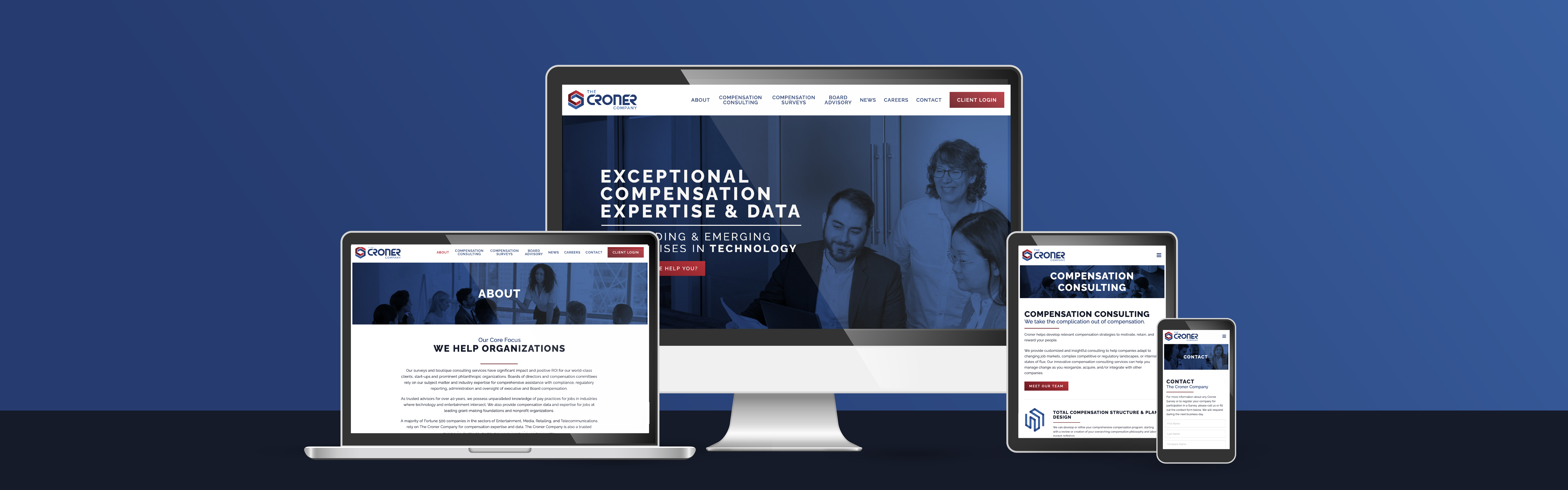
Website Design
User
Journeys
A website designed to easily guide people from the home page to the contact page with streamlined messaging and a clear call to action.
Responsive
Design
A mobile-friendly design so this website looks great and works seamlessly on all devices including computers, tablets, and phones.
SEO
Setup
A well-organized website with a sitemap submission to Google and Google Analytics turned on to track and grow traffic from day one.

“Daor Design was helpful, creative, affordable and responsive to every need. We used Daor to provide a design framework in WordPress that was easy to replicate and expand. Their design and graphic arts services met our high expectations and their assistance with technology and creativity helped us to launch a site that reflects current esthetics and user expectations.”