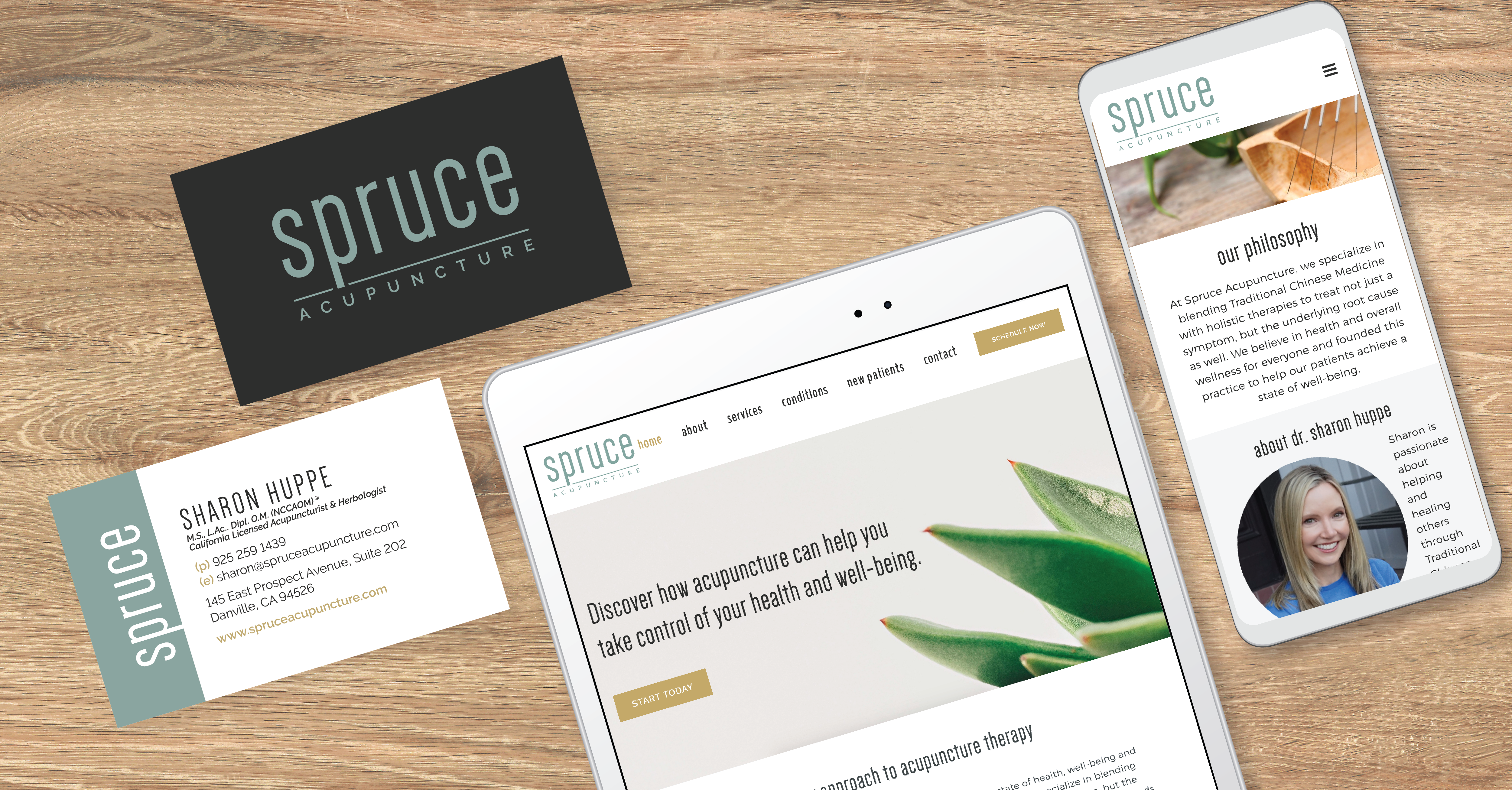
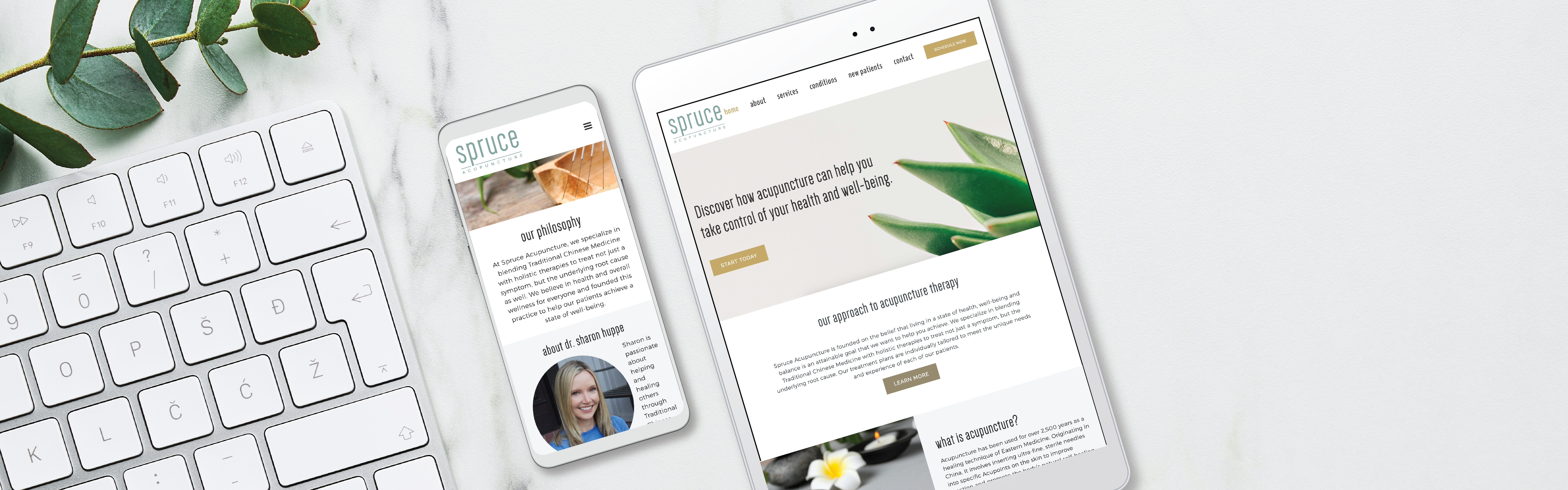
Spruce Acupuncture
Danville, California
A New Brand
For a New Acupucture Practice
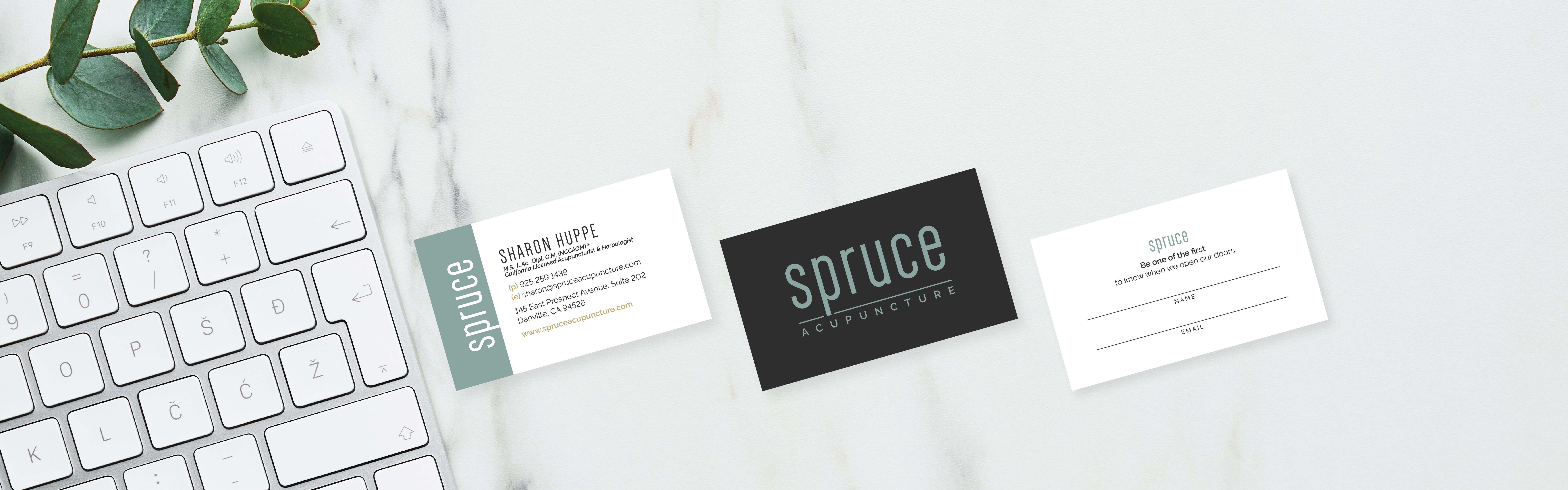
Sharon had her office location locked in and a grand opening date set for her new acupuncture practice. She just needed a brand to go with her new business. On a tight timeline, our team worked closely with Sharon to bring her brand vision to life with a logo design, website design, and business cards. It all came together perfectly just in time for her big event.
Logo Design
Brand Colors
Spruce blue paired with rich naturals.
Spruce
Color Formula
#8fa49f
Charcoal
Color Formula
#2e2e2e
Gold
Color Formula
#bcaa78
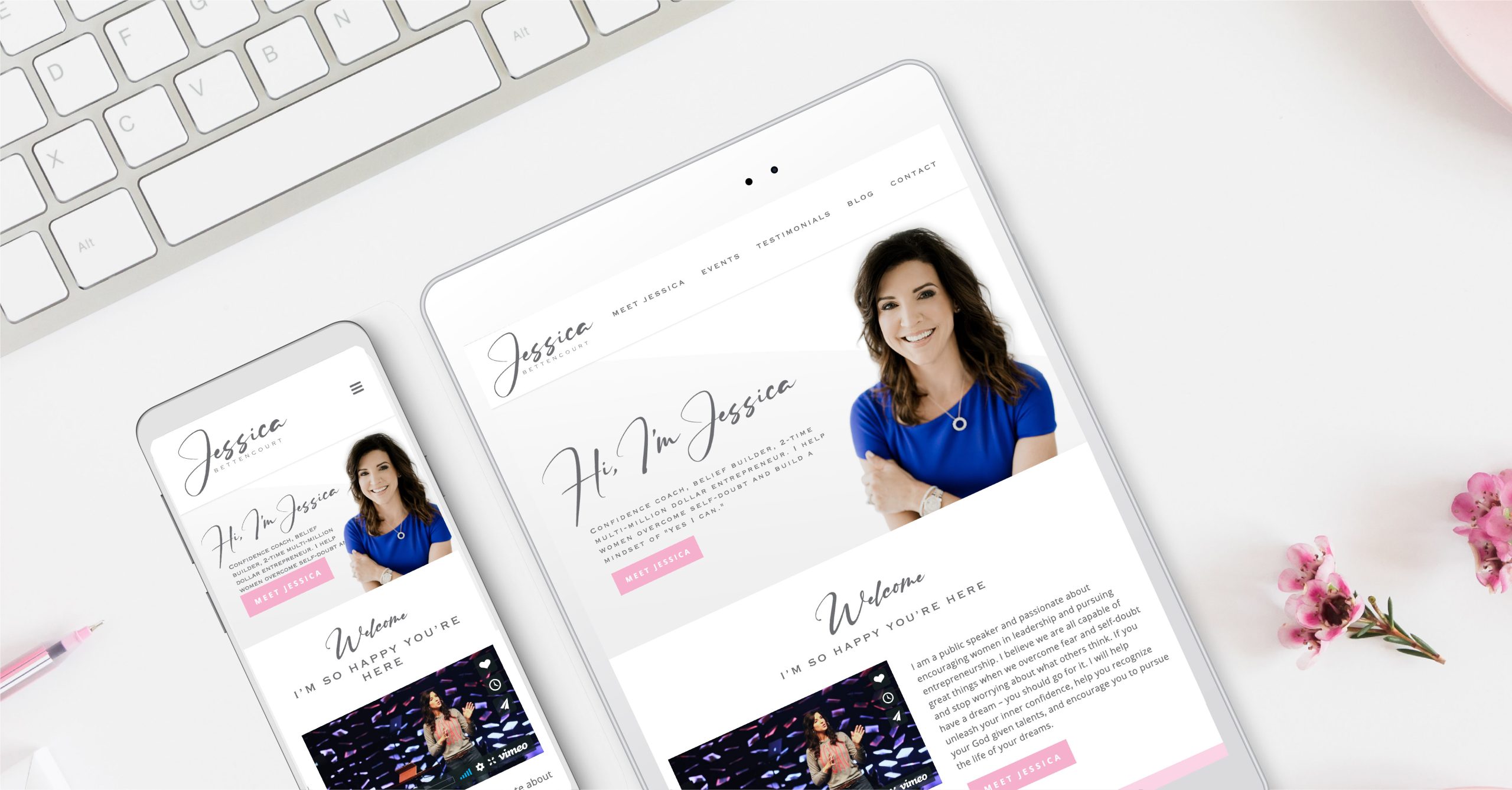
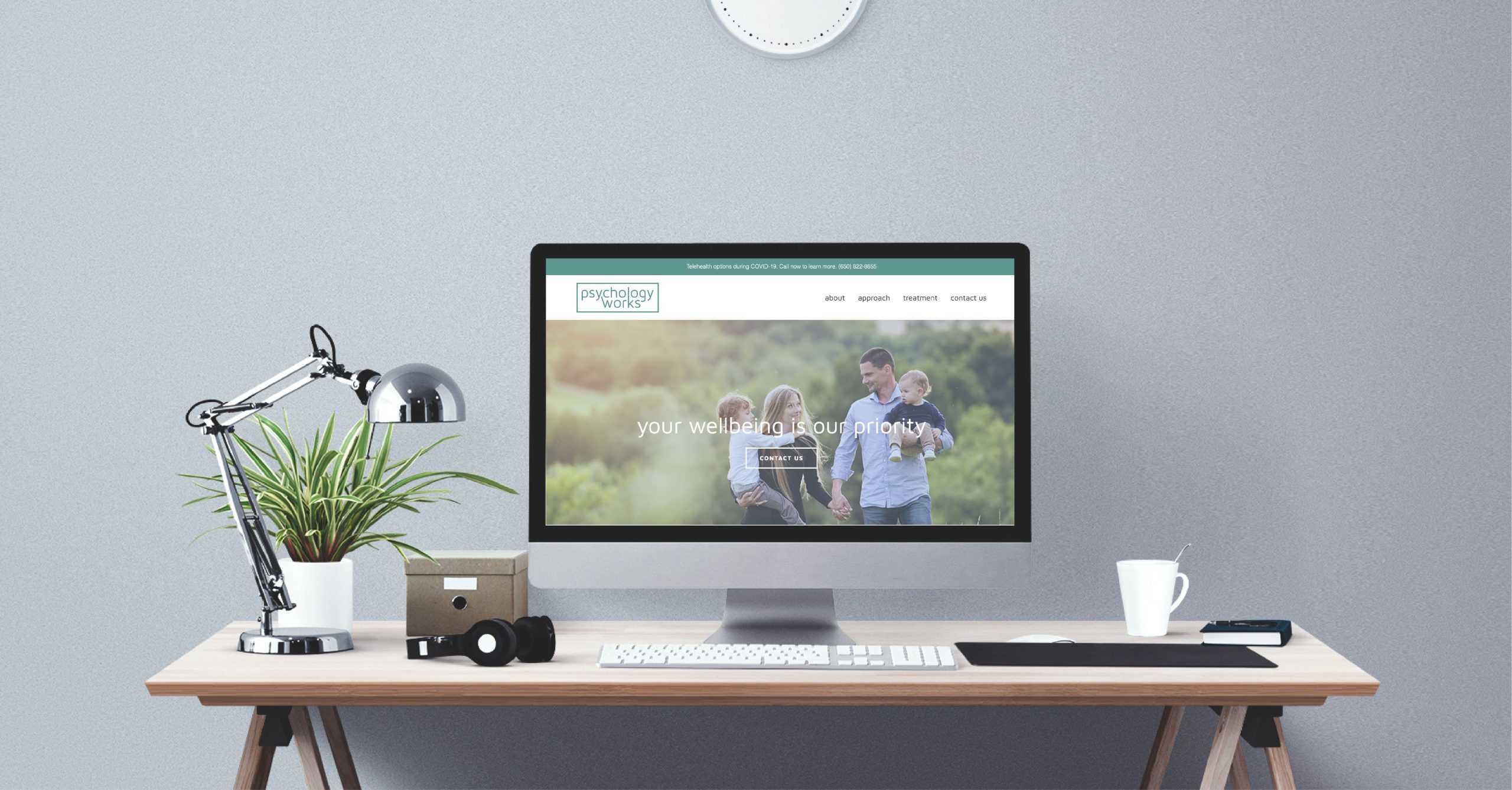
Website Design

User
Journeys
A website designed to easily guide people from the home page to the contact page with streamlined messaging and a clear call to action.
Responsive
Design
A mobile-friendly design so this website looks great and works seamlessly on all devices including computers, tablets, and phones.
SEO
Setup
A well-organized website with a sitemap submission to Google and Google Analytics turned on to track and grow traffic from day one.