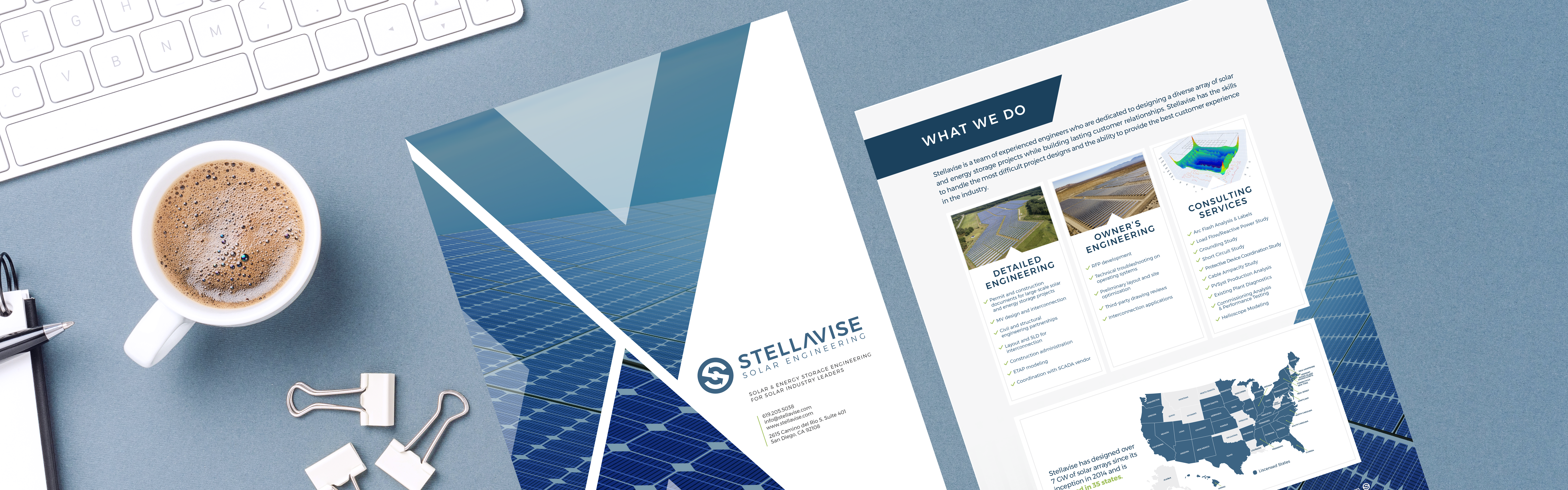
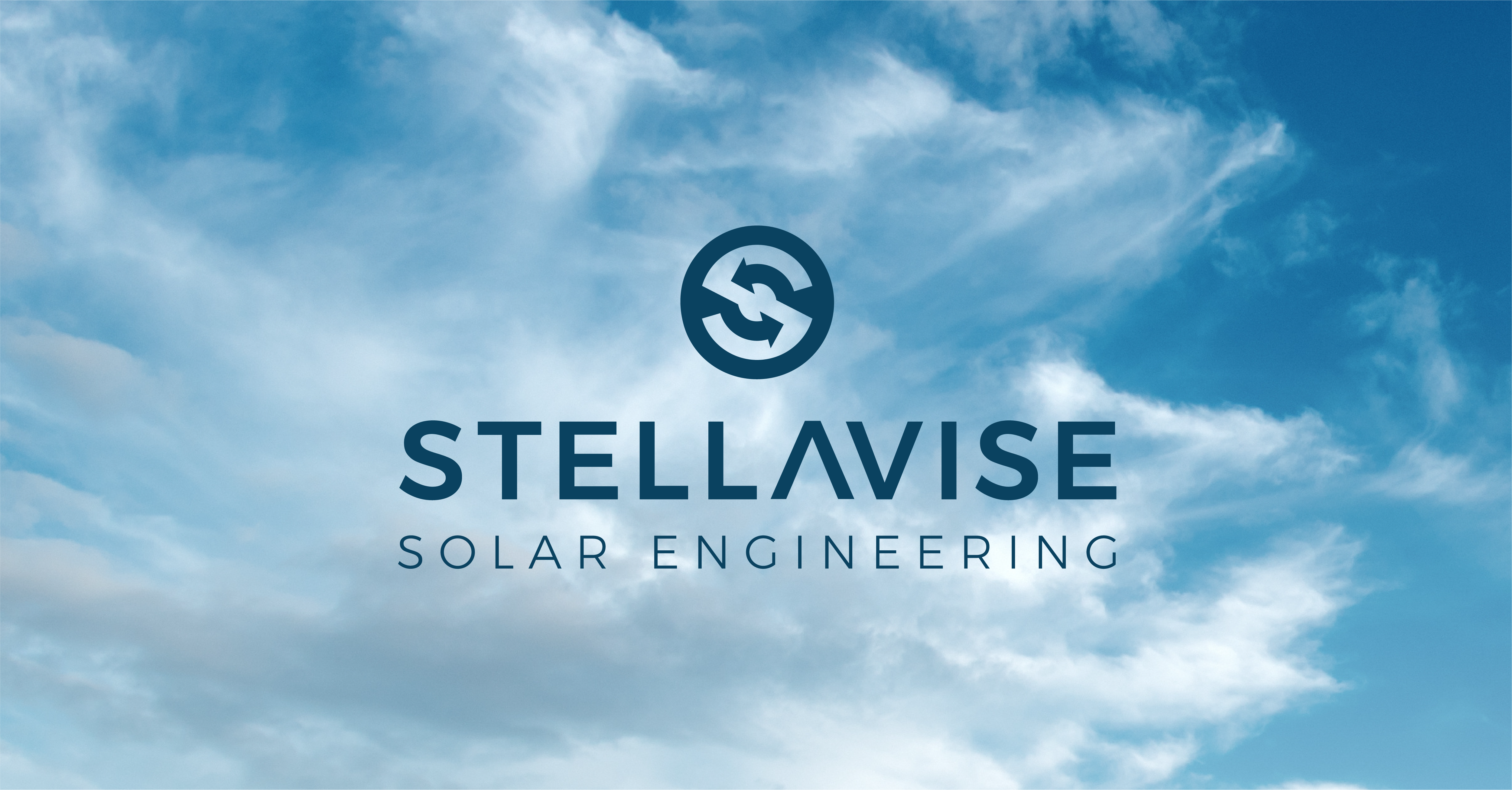
Stellavise Solar Engineering
San Diego, California
A Brand Refresh
For a Solar Engineering Company
We’ve worked with Brice and Matt, the Co-CEOs of Stellavise, for several years. Their business has evolved over the years, so they were ready for a brand refresh. While keeping their hard-earned brand recognition in place, we freshened up the Stellavise logo design, color palette and brand fonts. From there, we designed the new Stellavise website to reflect their refreshed brand and resonate with their target market. Take a look at our work with Brice, Matt and the Stellavise team.
Logo Design
Brand Colors
Dusty grays and blues paired with a pop of green.
Fog Gray
Color Formula
#edeeef
Sky Blue
Color Formula
#316487
Navy Blue
Color Formula
#0a4260
Lime Green
Color Formula
#99c44b
Website Design
User
Journeys
A website designed to easily guide people from the home page to the contact page with streamlined messaging and a clear call to action.
Responsive
Design
A mobile-friendly design so this website looks great and works seamlessly on all devices including computers, tablets, and phones.
SEO
Setup
A well-organized website with a sitemap submission to Google and Google Analytics turned on to track and grow traffic from day one.